Role
User Researcher
User Tester
Team
4 UX Designers
1 Project Mentor
Tools
Figma
Google Suite
Duration
6 Weeks
Background
Covid Symptom Survey 🦠
The Daily Symptom Screening is a process developed by UC Davis during the onset of the pandemic. Students, campus faculty, and visitors who take a survey every day and test every two weeks receive an “approved status” to access campus facilities.
Original
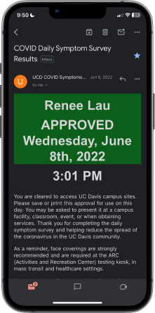
Covid Symptom Results
Original
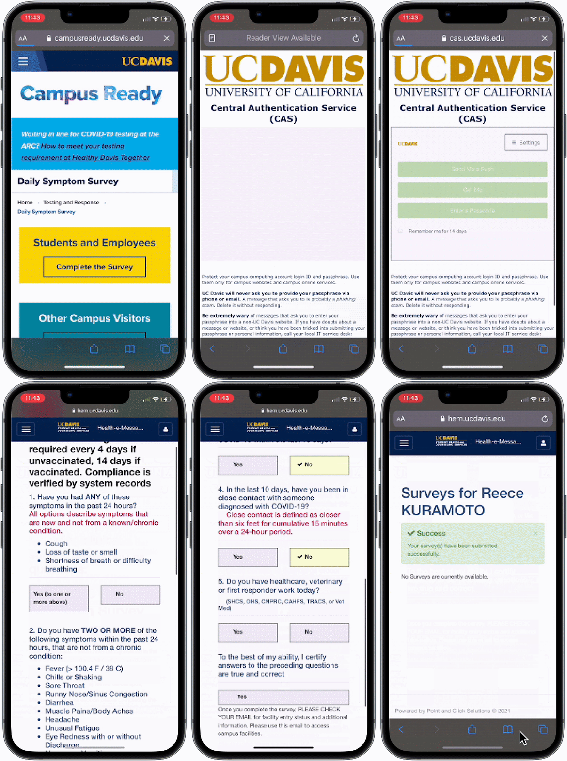
Accessing and filling out the Covid Symptom Survey
Our Challenge
However, many students and staff experienced
1. Difficulty in Navigation
2. Tedious Requirements
3. Forgetfulness
to access an “approved status”
How might we redesign the COVID symptom survey experience to be a hassle-free process while still ensuring the safety of the UC Davis population?
Solution
Rather than accessing through 3 separate apps (UC Davis Health-E-Messaging website, your email, Duo Security), I condense this screening process into one app to simplify navigation and reduce tedious requirements.
Building an all-in-one app ✨
The Survey Badge is displayed immediately and remains on the Home Page. Immediately learn about your badge restrictions with a simple click. Action items are directly linked on the Survey Results page.
Redesign
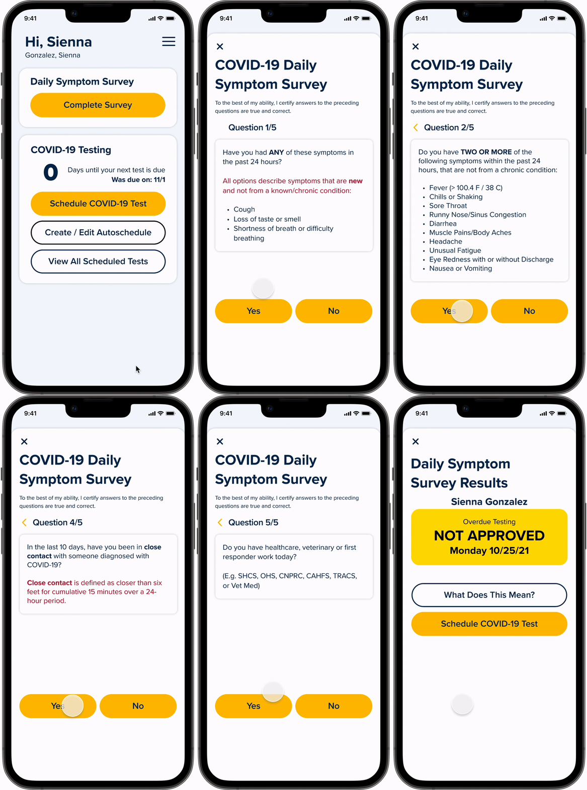
Covid Symptom Survey Flow
Redesign
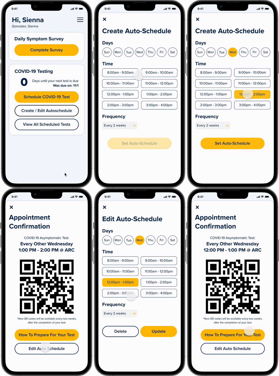
Auto-Schedule a COVID Testing Appointment Flow
Never Forget Again 🌀
Auto-schedule your COVID-19 tests for your preferred day of the week. Unlike the current scheduling process, I added an auto-schedule function because users often want to take their COVID tests at the same time every 14 days to stay on track. The next testing date automatically shows up on the home page after the previous appointment is complete.
User Research
Getting to know the students 🤝
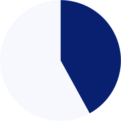
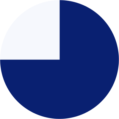
To learn about UC Davis students and their thoughts about the current Daily Symptom Survey, we sent out a survey via Google Form to yield the highest and most diverse number of participants. Among 58 students,
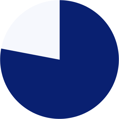
78%
Forget to fill out the Daily Symptom Survey
42%
Forget to schedule and/or go to get COVID-tested
75%
Dont read the questions on the Daily Symptom Survey


Insight #1
No reminders
“I wish it sent us reminders about when to get the next test. Sometimes when I'm in a rush but get an "unapproved" message, I have to quickly run and get tested before class begins... it's just a lot of stress.”
Result: The app allows you to auto-schedule your COVID-19 tests for your preferred day of the week.
Insight #2
Too many apps involved
“It's too difficult to access. You have to go through multiple pages and sign into health-e-messaging to get there.”
Result: We condense the COVID-19 screening process into one app.
Insight #3
Too tedious and repetitive
“I have to fill it on Monday to Friday for work purposes so I already mastered the process. It takes me 1-2 minutes to complete the entire process. However, I still find the survey frustrating.”
Result: Each question is displayed one at a time to avoid scrolling and makes the survey quick and simple to fill out while also ensuring the users read each question.
Research Summary
Many students often forget to complete the requirements for the COVID-19 screening. When they feel frustrated with the tedious current process, they wish for a simpler process since they have done it many times.
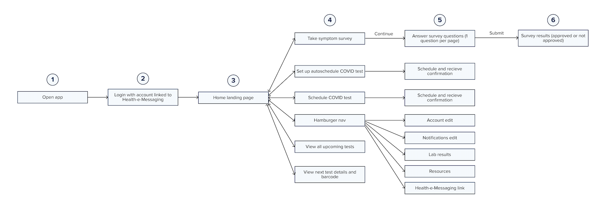
Streamlining user flow
From 11 steps to 6 📉
11 steps with 3 apps involved
User Testing
Putting it to the test! 💪
I asked UC Davis students to complete realistic tasks to ensure each flow of our prototype was clear and concise. I focused on the navigation of the app, making sure each feature was not hidden.
Before
After
Before
After
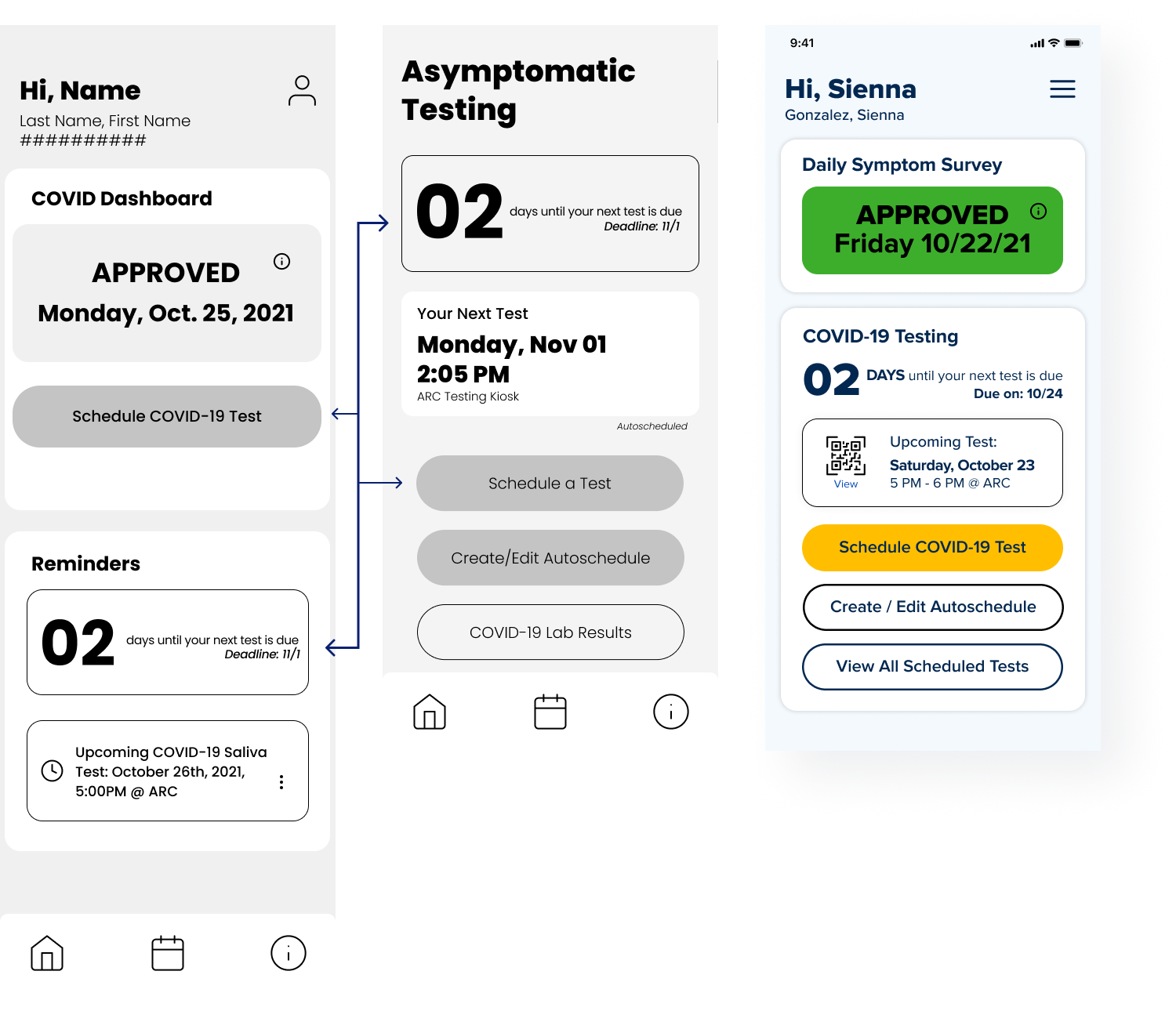
Change #2
Duplicate Information
There was duplicate information on both the Home Page and Scheduling a COVID Test Page. This created cognitive overload and confusion within the users when navigating through the screens. We also removed the navigation bar because all the information could be displayed on a single page.
Before
After
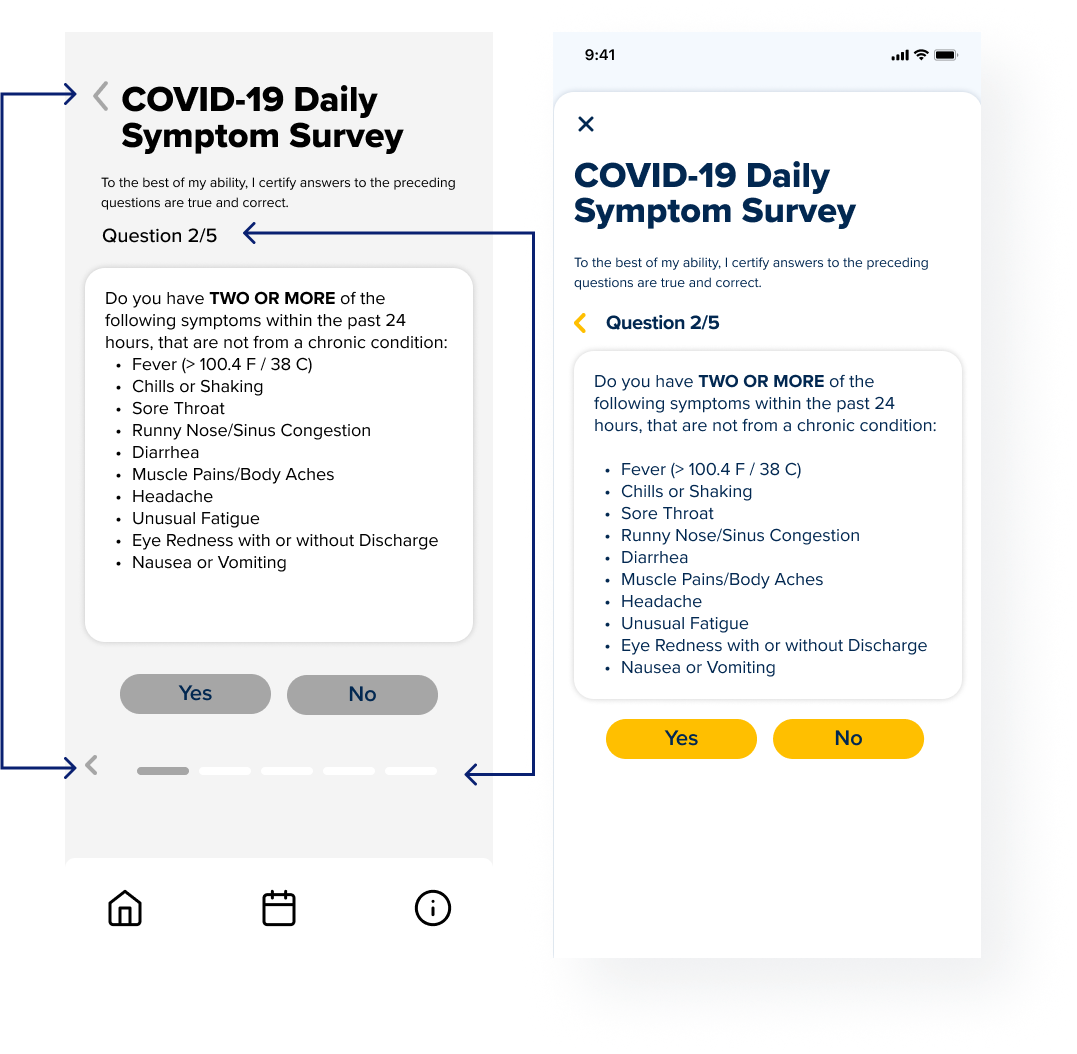
Change #3
Progress Bar
I removed the progress bar of the Daily Symptom Survey because it displayed the same information with which question the user is on
Change #4
Back Button
Users were confused about the function of the two "back" buttons as the same icon was used. To eliminate the confusion, I changed the "close" button to an “x” icon while keeping the "back" button as a chevron left icon.
Covid Symptom Survey Page
User Testing Summary
Our screens were too information-heavy, so users were having a difficult time navigating through the app and finding what they needed to find. We re-evaluated what information was truly necessary to include on each screen and established clearer visual hierarchies.
Hi-fi Prototype
Bringing it to life 🪄
Design System
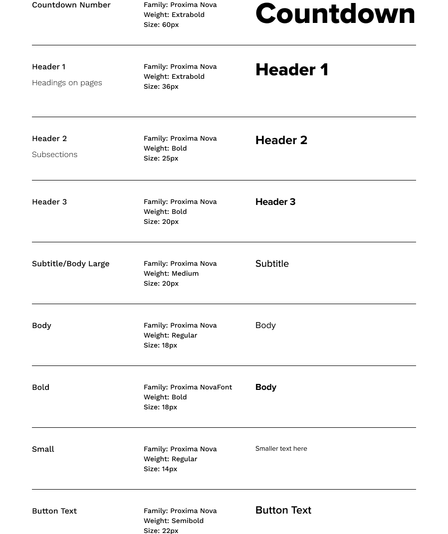
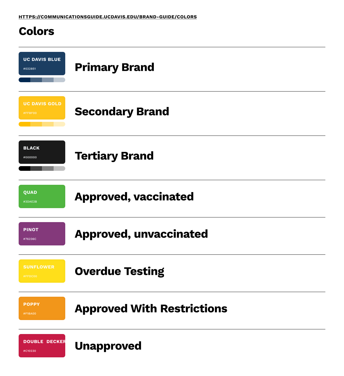
Our Design system utilized UC Davis brand colors. However, we designed our components for a more modern, clean, and friendly user interface by using rounded corners, light backgrounds, and soft drop shadows.
Final Product
Our COVID-19 screening app condenses the entire symptom survey process, by requiring fewer clicks and keeping all necessary components within a single application (11 steps & 3 apps condensed to 6 steps & 1 app!).
Flow #1
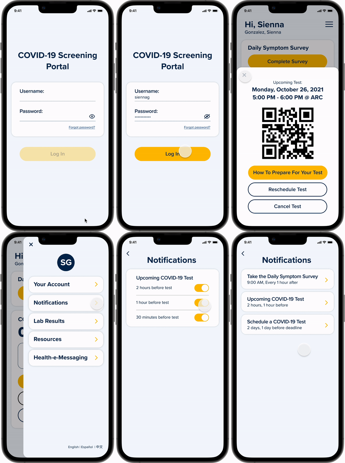
Onboarding & Homepage
Minimize Repetitiveness: Saved account & COVID related info (e.g. callback number, vaccination status, address for testing).
Save Time: A designated dashboard display on the home screen will make results more easily accessible to show for entrance to campus facilities.
Customize Notifications: Choose when and how frequent reminders are for (1) Complete Survey, (2) Schedule a Test, and (3) Upcoming Test to minimize forgetfulness.
Flow #2
Completing the Daily Symptom Survey
Minimize Forgetfulness: An automatic button appears when the survey needs to be completed and disappears once the survey is completed.
Save Time: Questions are distributed on separate pages to avoid scrolling.
Only Use 1 App: Survey Badge is displayed immediately and remains on the Home Page. Immediately learn about your badge restrictions with a simple click. Action items are directly linked on the Survey Results page.
Flow #3
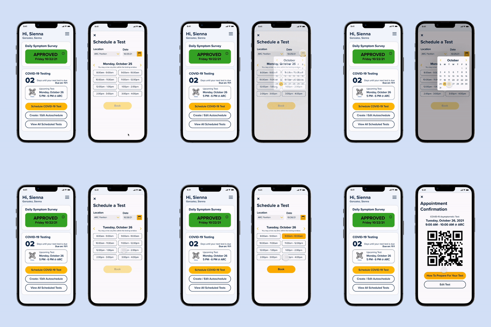
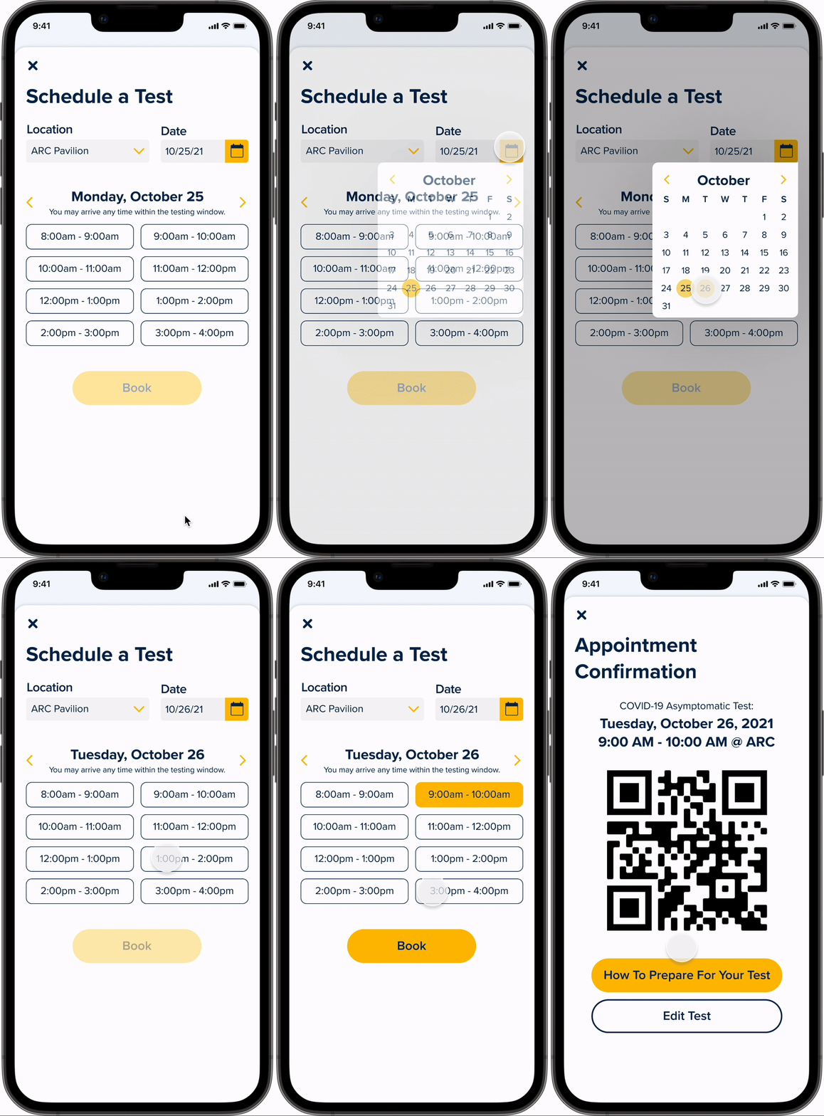
Schedule a COVID-19 Test
Simple Steps: Select a date, location, testing window, and edit anytime
Easily Access Testing QR Code: Each upcoming test is displayed on the Home Page
Save Time: Select testing windows instead of a specific time
Unlike the current system that displays dozens of appointment times at 5-minute intervals, testing windows consolidate the content on the screen and users can minimize scrolling.
Flow #4
Auto-schedule a COVID-19 Test
Simple Steps: Select a day of the week, testing window, frequency, and edit anytime
Minimize Forgetfulness: Auto-schedule your COVID-19 tests for your preferred day of the week
Unlike the current scheduling process, I added an auto-schedule function because users often want to take their COVID tests at the same time every 14 days to stay on track. The next testing date automatically shows up on the home page after the previous appointment is complete.
Reflection
Lasting Thoughts 
Lessons Learned
Our user testing phase showed us that we had tried to include too much information in our application, which made it confusing to use.
To fix this, we carefully examined each of our screens to decide what we needed, and based on this, we were able to consolidate and better organize the information and features in our app to streamline the user experience.
This short-term project essentially reinforced that learning how to prioritize user needs and establishing a clear hierarchy of focus for each app screen or website page is vital for an intuitive user experience.
Next Steps
If we had more time, we would conduct a few user interviews and more rounds of usability testing to ensure that the user experience is as simple and as intuitive as possible.
Currently, professors and workplace supervisors have to manually check each student or employee’s survey results. If we were to further develop this app, we would also like to figure out a way to address this issue to maximize efficiency.

