Role
UX Researcher
UX/UI Designer
Team
Independent Work
Tools
Figma
Miro
Google Suite
Duration
2 Days
Background
MyBill
MyBill is a website that allows UC Davis students and authorized users to view their bills, make payments, and manage student accounts. However, the site can be confusing, and with something as important as paying tuition, a confusing site can lead to detrimental mistakes.
Original
MyBill Account Activity
How might we refine the student experience of paying tuition and bills through MyBill?
Solution
Money at a glance 💸
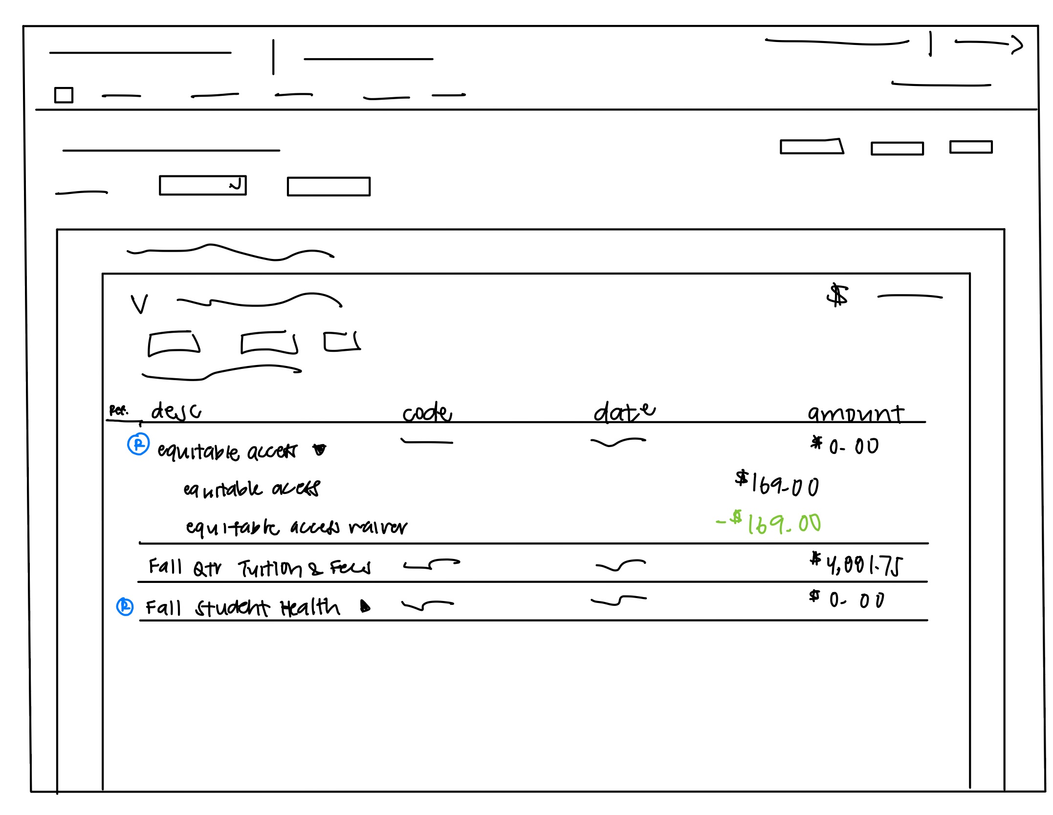
I decided to implement a refund logo so users can easily identify what transactions were refunded and minimize the duplicate lines to simplify the process when reading the “account activity.”
User Research
How do students currently feel?
In order to understand the problems UC Davis students face when viewing their bills, making payments, and managing student accounts, I conducted 4 user interviews with students. After the interview, I sorted my notes into categories to help distinguish the problem.
⭑ Insight #1
Refunding Payments
When receiving a refund on a charged item, users find it confusing. Instead of stating the balance is zero, MyBill creates a new transaction that cancels the old transaction with a negative amount.
Result: Users can easily identify which transactions are refunded and see the calculations after the refund, making viewing the account balance more efficient by simplifying the "account activity".
Insight #2
Third-Party Opt-Out
After viewing their bill, students found it a hassle to navigate through a new link to opt out of programs like UC SHIP and Equitable Access.
Insight #3
Too Much Unnecessary Information
Students thought MyBill contained too much information, especially in the announcements section on the homepage. This makes MyBill feel intimidating and overwhelming.
Due to the time constraint, I was only able to tackle the most mentioned pain point: the confusion of identifying the refunded transactions. From there, I created a “How Might We” statement to define and narrow the problem I am trying to solve.
Revised Problem Statement
Solving One Problem At A Time! 💪😤
How might we refine the student experience of paying tuition and bills through MyBill?
↓
How might we improve "student's account balance" in order to help students and parent see what is being charged and refunded
Ideation
Generating Rapid Solutions 😵💫
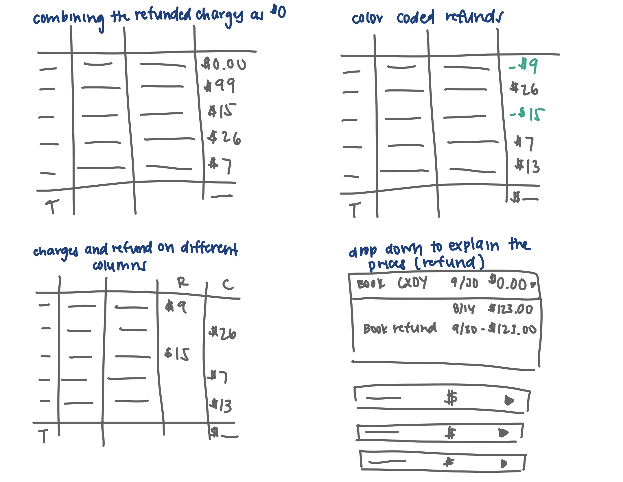
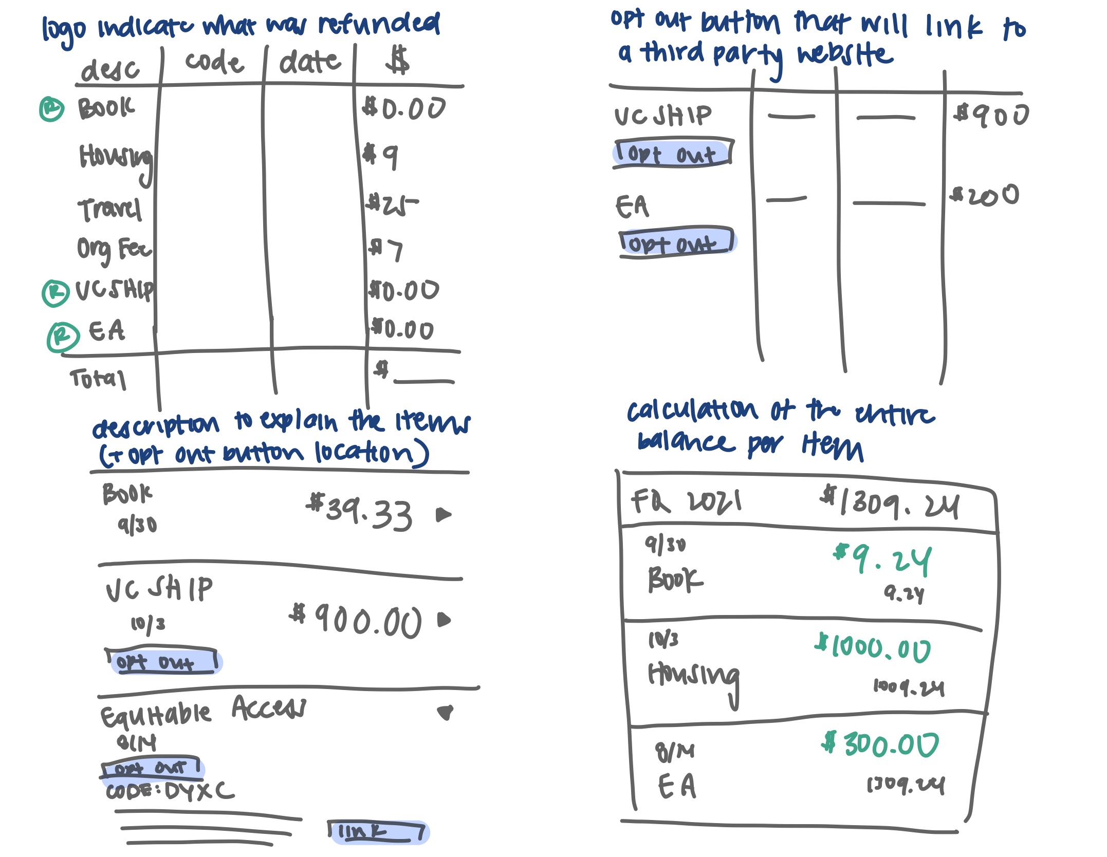
I quickly sketched out potential solutions and designs using the Crazy 8 exercise to jot down some initial ideas.


Prototype
lt's All Coming Together 😌✨
I combined ideas and insights from my Crazy 8s sketches and consolidated them into a single design.
Low Fidelity Sketch

Mid Fidelity
High Fidelity
Reflection
Looking Back 😌💭
Challenges and Takeaways
The define and ideation stage is the most challenging part of this design process. Even after analyzing and categorizing my data into main pain points, I had a difficult time choosing which pain point to tackle. I thought all pain points were essential to tackle but given the time constraints, I had to narrow it down to one.
The ideation phase was also the most challenging for me. During the crazy 8 exercises, it was also challenging for me to come up with 8 different ideas. However, it allowed me to explore other solutions and pushed me to think outside the box. This was useful, especially when I shared my crazy 8 sketches with some users. Although some of my ideas did not work as well as I thought, I still had other ideas to branch out of.
Next Steps
If I had more time, I would test my mid-fidelity before moving on to my high-fidelity. This way, I can ensure I am designing for my audience rather than myself.
I would also like to spend extra time learning features, specifically components, on Figma which would help me speed up the process of prototyping. After designing the mid-fidelity prototype, I found myself individually changing each feature of a button/section which I knew could have been avoided if I understood how components worked.
